October 24, 2024
When it comes to explaining the difference between interior architecture and interior design, architect Stefan Eder often deploys a simple and effective visual.
“Here is how I explain this to our clients,” Eder says. “If you take the building in your hands, turn it over and shake it, everything that falls out is rooted in interior design. What’s left in your hands is architecture and interior architecture.”
Eder opened the California offices of Mosaic Architects & Interiors (mosaicarchitects.com) in 2006, a year after his partner, architect Jane Snyder, launched the company in Colorado. Together they run teams — “a passionate collective of architects and designers” — headquartered in Santa Barbara, San Francisco, Napa Valley, and Boulder.
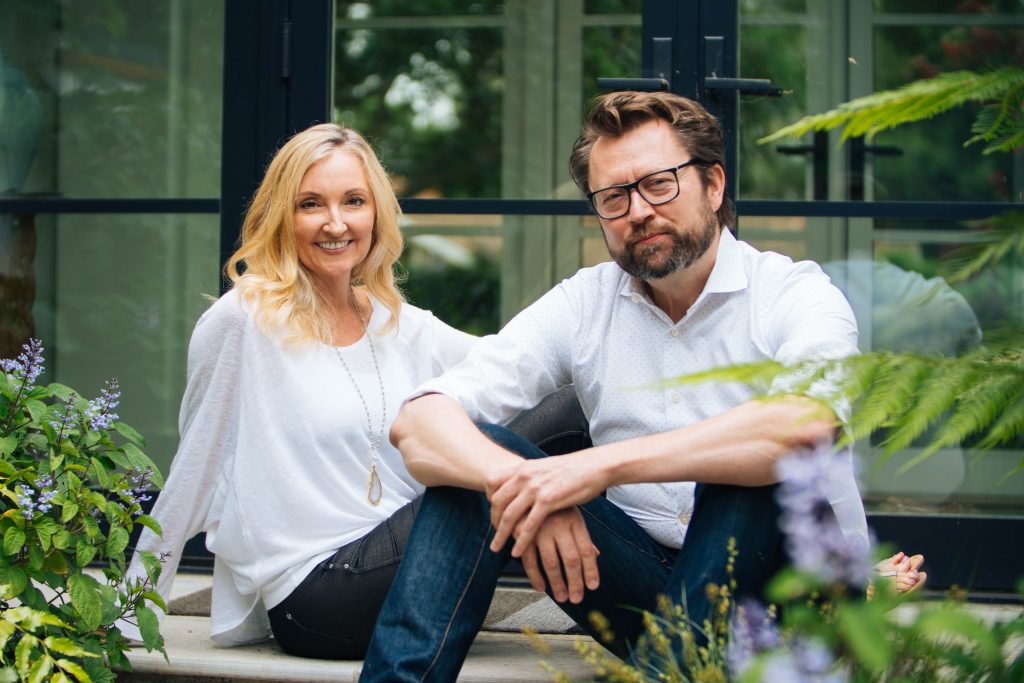
Over the years, Snyder and Eder (pictured) have worked closely with Giffin & Crane on a handful of custom homes and remodels. For insight on their process, we caught up with Eder to talk about a uniquely designed home built brand-new in the foothill above Santa Barbara.
G&C: How did you become involved in the project?
Stefan Eder: We came to the project by coincidence. During lunch with Geoff, we mentioned that we had just completed two curved residential projects, and we shared some of the lessons we learned to make curved homes look and feel good. Geoff became more and more interested in our design approach and eventually asked us to visit one of his projects: A curved house for Keith and Lorraine Reichel. During our site visit, we happened to run into the Reichels. We started talking and we were hired on the spot.
What was your role?
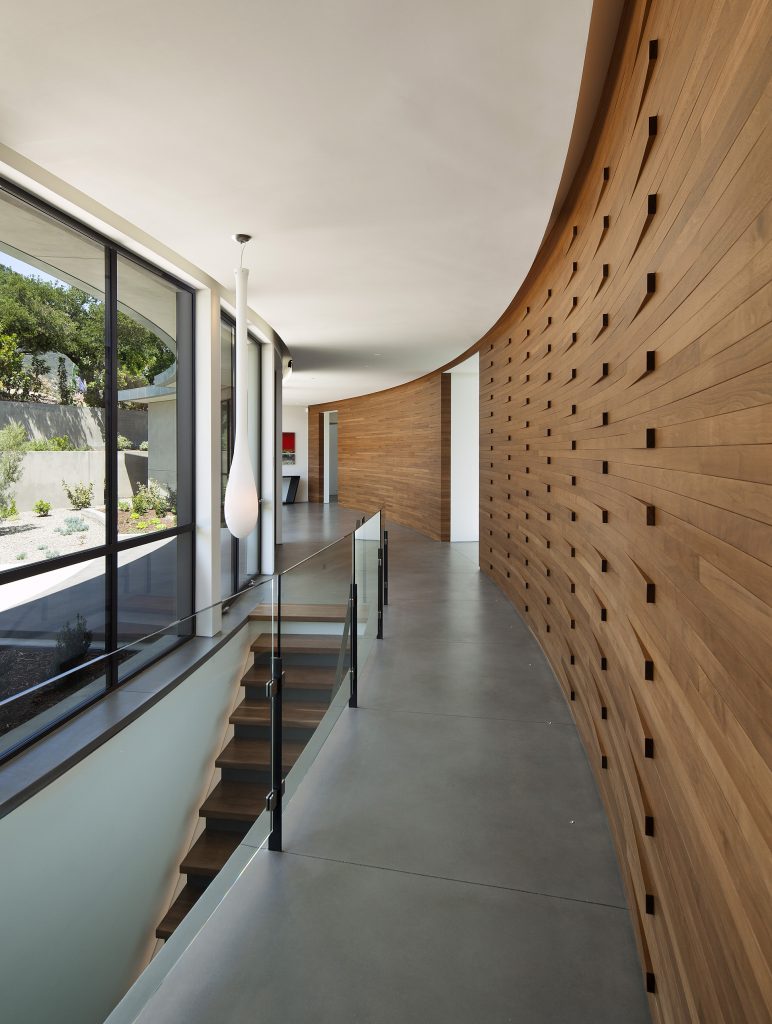
We were brought on during framing to enhance architecture and interiors. Our first assignment was to evaluate the floor plan and spaces. After a few visits, feeling the rooms and checking the views, we made changes to the floor plan to improve flow and layout. Keith and Lorraine loved these changes. We then redesigned and dialed in ceilings — quite tricky in a curved house with sloped ceilings.
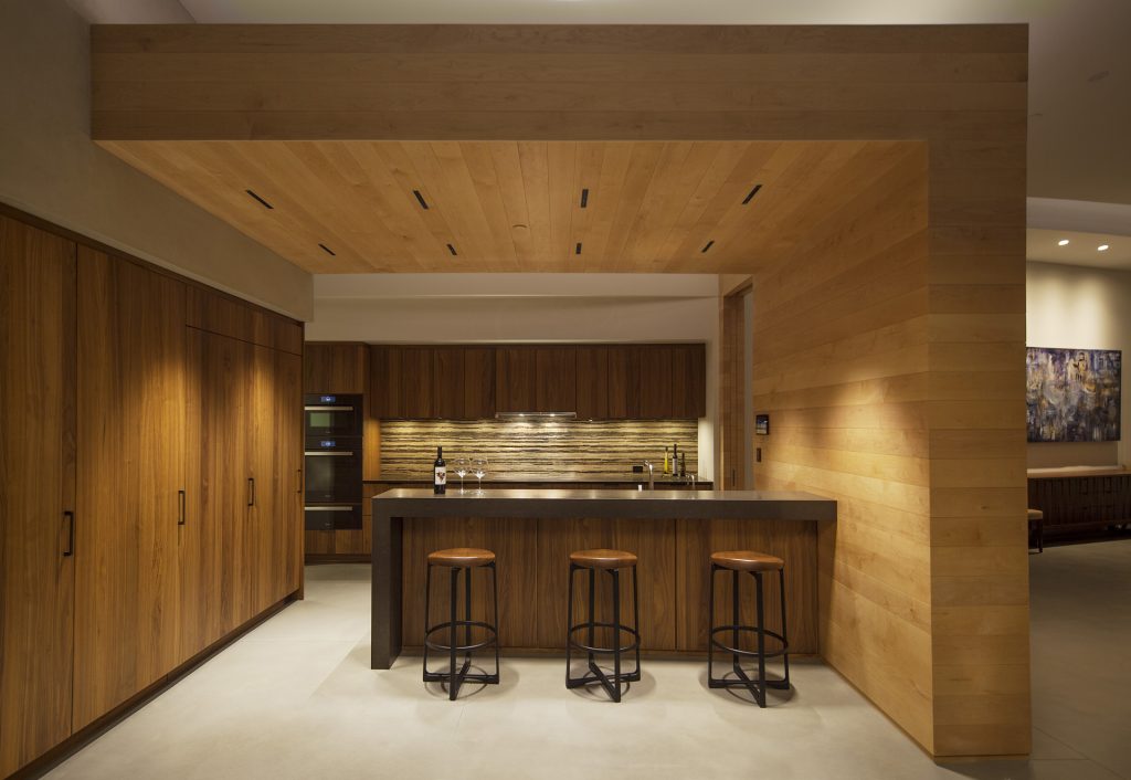
Once ceilings were established, we redesigned lighting to enhance architecture and interiors. From there we redesigned the stairs, guardrails, the kitchen, fireplaces, fountains and other elements.
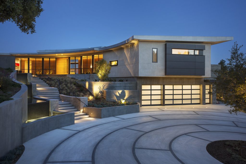
One major element we added to the design was the approach leading to the house with exterior steps, landings and a cascading water feature that was a fitting companion to the home. Matching the house, we used board-formed concrete to create ponds with spills, and designed various sounds of water that change as you approach the front door.
What did the Reichels have in mind overall?
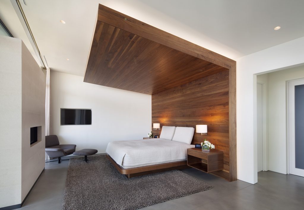
They envisioned a home that felt strong and rooted at the site while taking advantage of breathtaking views. Seamless indoor-outdoor living was important to them both, on the view side and the arrival side. Overall, they wanted a modern and contemporary home, clean lines with playful accents and warm, inviting spaces with good flow and a strong emphasis on timeless architecture and interiors.
Contemporary projects can sometimes feel trendy and “in the moment,” only to become outdated within a few years. We all have been in homes that were built in the past and we’re shaking our heads, “What were they thinking?” Keith and Lorraine wanted a home that would be considered beautiful and elegant many decades in the future.
How involved were they in the process?
They were very involved in the design, and during site visits. Our routine was to meet on Friday afternoons. Giffin & Crane always had the site ready and clean for us. We discussed design ideas and topics, walked the spaces in question, looked at mock-ups, and always made sure together that the overall vision was never lost. We might have had a glass of wine or two during these meetings . . . but that could be an urban legend.
Can you speak to a particular challenge that came up?
A curved house with a sloped roof is significantly more complicated and complex than a regular, right-angle structure. With the help of Giffin & Crane, we built a lot of mock-ups in the field and tested layouts with the owners walking the project with us. This was key in establishing the right feeling for them.
Looking back, what’s your lasting impression?
Mosaic Architects & Interiors was able to create a contemporary home that feels warm, welcoming and timeless. Like I mentioned previously, modern houses often feel trendy but this home feels elegant and timeless as it ages and becomes more seasoned and rooted.
Anything you’d like to add?
Keith and Lorraine are awesome, sophisticated clients. We love working with them, and they truly share our attention to detail and clear vision. Recently, they hired us to design their new home in the Santa Ynez Valley, which is currently in the design and development phase.
